


The Perished
- Jessica White
- May 13, 2019
- 5 min read
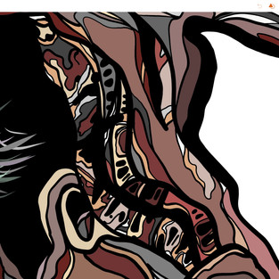
One of Four Digital Yew Tree's on Display at My Degree Show, 2019

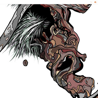
The Perished was my first digital Yew Tree that I created for my degree show.
This piece is my favourite of the four because I love the composition, colours and detail that I added to the piece.
Below is the original photograph that I used and worked from to create this piece. I started to use monochrome photographs as inspiration as being in black and white I wasn't confined to the exact colours I saw in the photo, I had the freedom to use memory and expense to fill in the colours that I thought worked to represent the fallen Yew.

You can see similarities between the two images but I purposely didn't want to completely replicate the photo so I only used the photo as a guidance of composition, identifying shapes and forms within the tree.
For my prints I focus on the ancient Yews of Kingley Vale and this one struck an interest due to its unique structure and detail. I look for gnarly bark and twisted trunks as they are so interesting to draw and more interesting to look at.
I chose the name 'Perished' as it related to the state of the fallen yew I was fascinated by, the tree was lifeless and dead, it was lost and decaying, the tree had perished. Yet there was still signs of life around the fallen tree, thriving plants were seeking refuge from this Yew, ferns and grasses grew from the tree itself showing how life keeps moving on around us even after we are gone.
The Drawing Process
Here is a screen shot of the app I use to create my prints on my iPad Pro. The software itself is called Adobe Draw.

The app functions are very simple to use which works for me perfectly as I'm not a genius with computers but I have been able to learn to not only use the program to make art but to adapt the simple tools to sculpt and explore a new and unusual style, developing a process of experimenting with how I represent a tree.
On the left side of the app you have your selection of tools, there are five different brushes all with a different shape. I only use two of them, one being the one on the top as I use that one to draw out a basic outline and adding in any little details. My second chose of brush is the second brush option, this one replicates a more typical paint brush with a pointed end.

I've come to use the second brush more than the other whilst I have developed my prints due to its more precise tip making it easier to join lines together and that the brush when you apply pressure to the pen changes width, helping to add depth and fluidity to the bark.
Blue Line - Second Pointed Brush
Black line - Original Brush Used - Close Up Detail & Basic Outline
Below is a time-lapse video of the whole process ...
'The Perished' Time-Lapse Video
Its hard to see how much time I spend on a piece as the video is sped up, this piece in particular took a good few hours to create as to begin with I take time to get the composition right and all the shapes in the right place, then I spend a long amount of time filling in all the details big and small and being me I tend to change bits around which can take just as long, if I don't like what I see I have to change it to make it right. But the longest process of all is the colouring in.
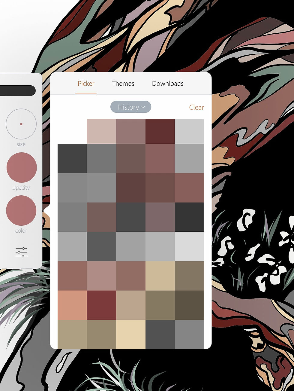
Here's a screen shot of the beginning of my colour palette history for this piece, the colour list is longer!
The colours are all relatively similar and complimentary but a big majority are the shame colour but in different shades. As you can see for this piece I have stuck to warm brown, burgundy colours with a hint of off blues and greens and greys.
When I get to the part of adding colours I always start from scratch, meaning I zoom in on a part of the Yew then I go to my colour wheel and start experimenting with different colours and shades and seeing what I feel works and looks right for the piece, still staying relatively realistic but applying colours that I see within the tree when I visited and took the photograph. As I've mentioned this part takes the longest as I'm very particular on what colours I feel fit, so I'm constantly changing and altering parts to make up a detailed and colourful print.

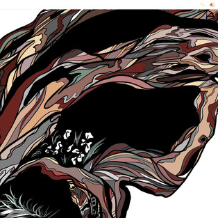

Close Up's ...
With my prints I love the little details and the odd shapes that you come across, the black voids are a key icon with my work including my continuous line sketches.

These voids are a big focus point that breaks up the print, plus adding to the idea of portals and thresholds ...
The Inspiration
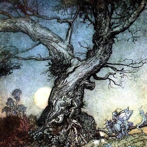
This is were it all started, with this painting by Clare Woods 'Daddy Witch'.

I first viewed this piece when I went to an exhibition at The Towner gallery in Eastbourne. I was instantly inspired by Woods piece, Daddy Witch. I was in awe of its scale (218 x 351 cm), colour, surface texture and abstraction of nature. This piece was the turning point for my work practice as I became focused on capturing the vibrancy of trees and representing them in amore abstract, less recognisable form. Clare Woods method of creating became the way I chose to make my work, starting with capturing photographs at particular sites, specifically kingly vale, to then using those photos to help develop a piece. I value the whole process of which I go through to create my prints, even the documentations of photographs and sketches are art in themselves even the time-lapse video is of great importance to show how I make my work.

With Woods work there is a sense of mythical fairytale animation about them. The way she captures and applies colour is more abstracted but you can still make out what it is, her paint is thick, glossy and dreamy like, making think of Disney animation.
Even though her work is dreamy like her work also has a dark eerie side to the beautiful. The forest appears cheerful ant first but you soon get lost in the hopelessness of darkness and grotesque faces appearing in the painting, I always think of Walt Disney's first feature length movie 'Snow White and the Seven Dwarves'. The scene within the movie where Snow White is running through the forest, a forest that adapts to her fears, playing with her emotions, feeding off her and running with her wild imagination of a haunted dark place full of horrors.
I'm captivated by Eyvind Earle's illustrations (Sleeping Beauty Background Illustrator/Animator) and Arthur Rackham's illustrations (British Book Illustrator - Best Known For Grimm's Fairy Tales Illustration).


The dark eerie yet beautiful trees of the forest, a dark and haunting place ...
My prints originate from a form and style of representing trees for entertaining purposes, either book or film but have developed further to my own style of using a digital program to represent dramatised trees in a similar style to animation and illustration to create effect. The process of creating the piece has become significant in its own as I feel that the making is just as important as the outcome, the decisions and changes made to make that piece the way it is.
Each piece is individual, they all have their own processes, inspirations and visual outcomes, yet they all work and link together as one.


Comments